Downloadables
Download the PSD file for this tutorial!
Download the Fullsize Jpeg for this tutorial!
Step 1
Create a new document about 1000x1000px then select the text tool and type a letter or number; if you want to follow me exactly then use the number four. Use a very bold font, I used Helvetica Black in italic. Set the size of the character to around 500pt. (If you don’t have Helvetica then use Arial Black then go Window>Character then with the text highlighted press the faux italic button). Make sure you place it roughly in the middle of the page.

Step 2
Now right click on the text layer then hit convert to shape. If you double click on the layer thumbnail then you can change the colour of the text, I changed mine to a blue colour.

Where are we going?
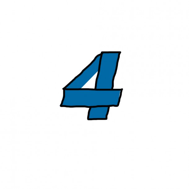
Below I just sketched with the brush tool roughly what I wanted to achieve. It is often useful just to sketch on your document in order to remind you where you are going, you can easily switch the layer off later. You don’t need to copy me here by the way but basically we want to split the 4 up into three segments which overlap.
Step 3
Grab the line tool and change the weight of it to 1px and make sure the foreground colour is black.. Next draw two lines where I did so that they follow these edges of the 4. You’ll see that in this font that the ends of the sloped section (upper left) don’t fall on these two lines. We have to quickly fix this. If you’re using arial then you may not have this problem so you can just skip to step ###.

Step 4
Change to the direct selection tool (white arrow); this is found by press and holding on the arrow button in the toolbar.
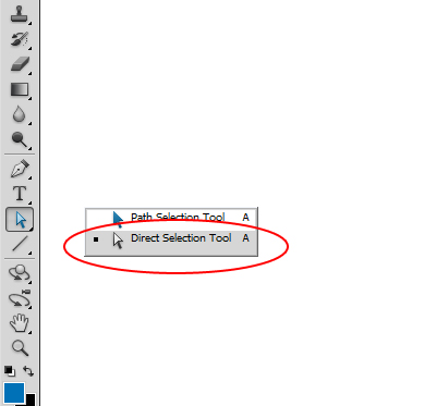
Now there’s a wee sequence to doing this correctly. First click on the edge of the 4 (point 1) then click and drag point two over to point three so that it sits on the black line.
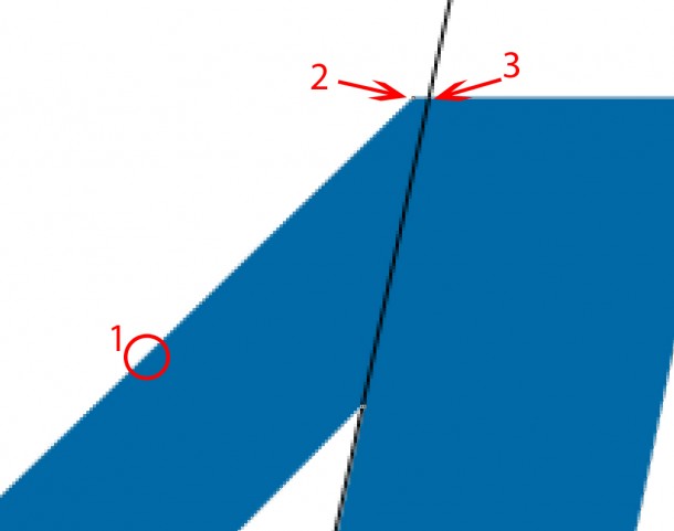
Do this with the other end of this line so that your 4 now looks like this. You can now just hide or delete the layer with the lines on it.

Step 5
Now click on the edge of the 4 again so that its path is selected then either click on each of these points then hit delete or alternatively right click on each of them and hit delete anchor point.
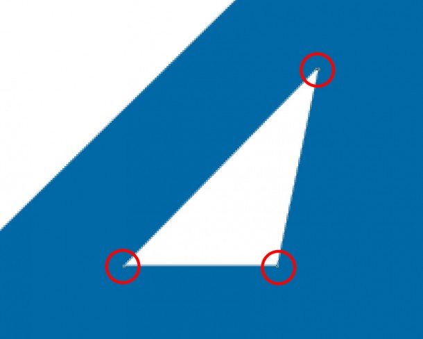
Your 4 should now resemble the image below.

Step 6
Okay we have to do some modifications to the layers now, so make sure the layers panel is visible. Create a new layer group (small folder icon at the bottom of the layers panel). Now hold alt and drag the vector mask from your text shape layer to the layer group, this should copy it. You should also probably rename the shape layer to ‘original’.
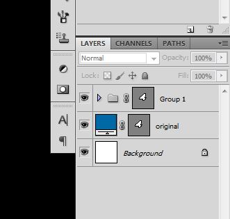
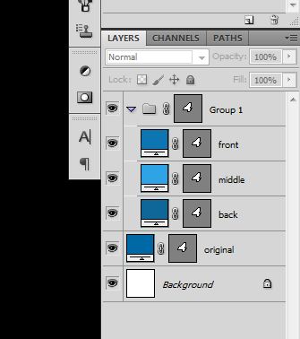
Now select the shape layer then duplicate it three times by hitting Ctrl+J. Next drag all these new layers onto the layer group. Rename them like I did below and and then change the colour of each (double click on the layer thumbnail); I used these colours:
Front: #0d76b2
Middle: #2ea4e7
Back: #0f6799
You can also now hide the original layer.
Step 7
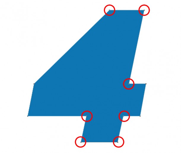
Select the front layer and again with the white arrow click on the edge of the shape then delete the anchor points indicated below in the same way as you did in step 5.

Step 8
Now select the middle layer and use the same process, I don’t need to tell you which points to delete this time, you just have to delete all but the four that make up the tall rectangle.
Your image should now look like this.

Step 9
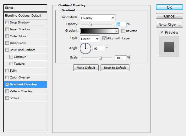
Now we’re going to add a gradient overlay to each of these three layers (you can get to the layer styles by right clicking on a layer then selecting blending options or by double clicking on a layer).
For the front shape layer use these settings:

Use these for the middle shape layer:
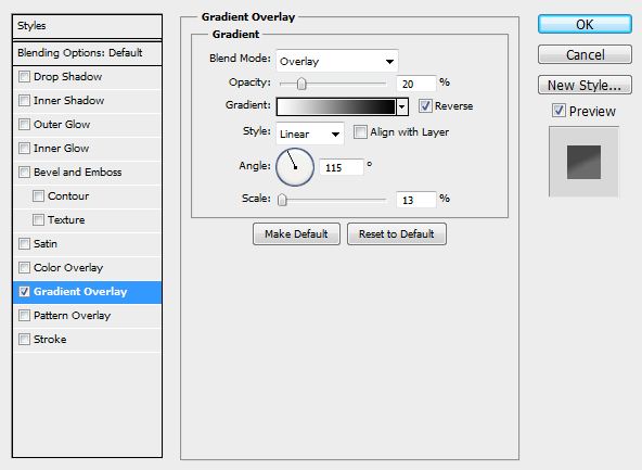
And these for the back layer:
And your image should look like this so far.

Step 10
Now create a new layer directly above the back layer. Now select the brush tool and choose a soft round black brush maybe about 80px diameter. Now brush a shadow behind the tall rectangle, you may have to try a few times in order to get it right.

Now change the opacity of this layer to 25%.

Step 11
This time create a new layer directly above the middle layer and with the same brush paint a shadow just along the top of the long rectangle. Then change the opacity of this layer to 25% as well.

Step 12
Now select the text tool and place some text on the long rectangle. Make sure this text layer is above all the other layers but still within the layer group. Type some text into this layer in a very bold font like Helvetica Black or Arial Black. Change the color of the text to a light blue color.

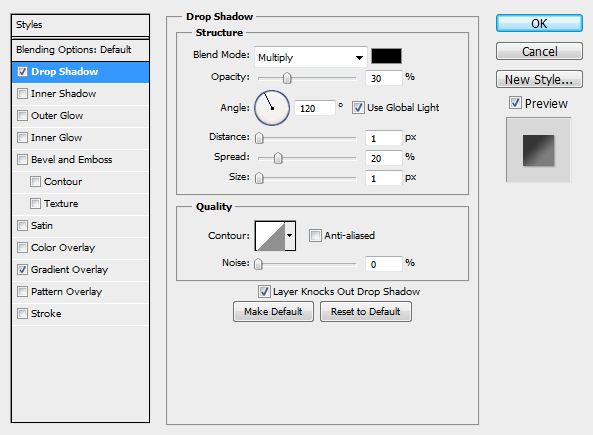
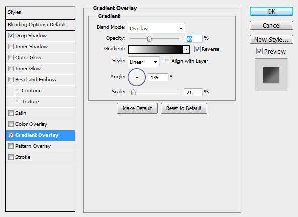
Now add a drop shadow and a gradient overlay to this layer using the settings shown below.
Step 13
i then duplicated this text layer then changed the font to a regular weight and used a smaller size and typed some more text here. I had to go in and scale down the drop shadow on this new text layer.

Step 14
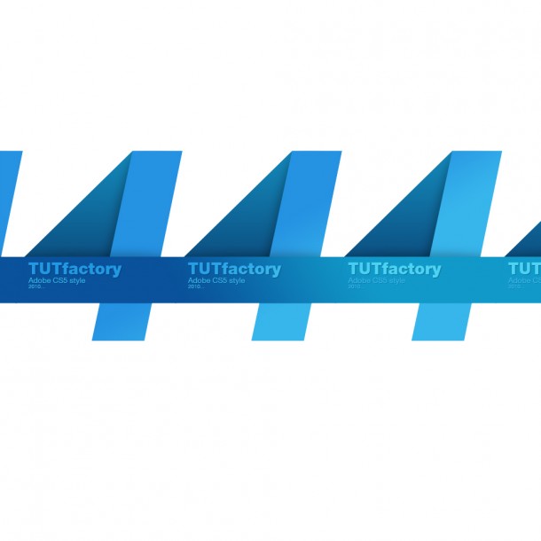
Now that’s us finished creating our image. We now want to create a background for our image. Select the layer group then duplicate it (Ctrl+J) and move it along so that it is placed next to the original one. Do this a few more times until you’ve filled to both edges of the document. Now to keep this organized put five layer groups inside another layer group.
Step 15
Now duplicate this layer group and move it upwards and to the side so that they tile together like in the image below. Do this a few more times until the full document is filled up. We could have merged the layer before we moved it but it would mean the gradients wouldn’t blend.

Step 16
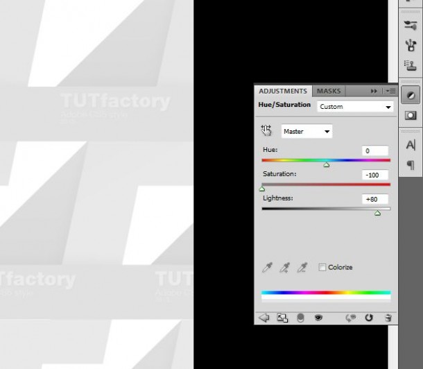
Now add a hue/saturation adjustment layer and use the settings shown below.
Step 17
Now in this step we want to find that original layer group; the one that we duplicated. So try and find it, it should be within another layer group. Once you’ve found it then just drag the layer group to the top of the layer stack above the hue/saturation layer. You should end up with an image like so. You could always expand the document to create a wallpaper or you could even use the same idea for a a business card design. Another thing you can do here is to add another hue/saturation layer then change the hue to achieve different colors. Hope you enjoyed the tutorial and make sure you share it if you did.

















Fergus
Nice tutorial!
thank you :)
Bratu Sebastian
Wow, really nice tut!
pixi
This has learned me a lot :), Thanks. Although my gradients didnt blend like yours in step 14. I am presuming its because my PS version is only cs?
Freelance Web Designer Leeds
nice tutorial, and very easy designing steps to follow
saha
Very easy and detailed guidelines to follow.
Thanks.
jeb
step 8 I had to use path selection tool.
shahinur
I have seen first time this site. I learn many effect from this tutorial. Really nice work.
oglasi banja luka
Very precise and detailed for begginers as it should be
media
Word – Press is a vast platform for web development and blogging, this
extensive community is always being surrounded by several myths and misconception.
The provider will put their men to write reviews at 24 or 48 hours interval
thus ensuring a slowly but surely app advertising pace.
File sharing programs can sometimes download porn to your computer without your
knowledge.